For the 1.10 I decided to change the unread counters in the subscription list tree view. Until now the number of unread items was displayed in braces right behind the feed title in addition to the feed title displayed in bold font weight.
Before
Here is how it is looking in the releases so far:
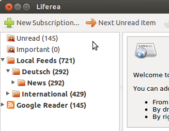
There is a serious disadvantage that you only notice if you do not have much screen space. Imagine a netbook for example. There the subscription titles will be truncated as you won't spend much space on the left pane. And the first victim of the ellipsizing is the unread counter. But out of the three visual elements: favicon, subscription title and unread counter, only two are important. The favicon allows you to easily find the feed, and the only real information is the unread counter.
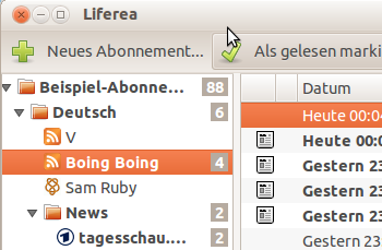
After
So have a look at this screenshot, especially the "tagesschau" subscription:
Actually a lot of applications especially in the Mac world do this already and I think Liferea also benefits. I'm aware that the change is a bit visually disturbing and I hope most users will still like it. I'm looking forward to your feedback!
PS: Round borders on the number background is sadly not possible with
GtkCellRendererText.